@ University of Toronto, Mobile Application Development Lab (MADLab)
As part of a graduate-level capstone collaboration with UofT MADLab, I led the design system efforts for the upcoming EventNest section of UofT Mobile. This case study focuses on atomic design principles and Figma documentation best practices that I employed to create a scalable and cohesive UI foundation for a student-facing app.
Overview
Context
UofT Mobile is the University of Toronto’s official student-facing app, offering access to campus services, course tools, and navigation support. Our capstone team collaborated with UofT MADLab to design the upcoming EventNest section of the app, aimed at helping students find student groups and events.
My Role & Contributions
While the overall redesign was a group effort, I led the effort to create and document the design system. My goal was to establish a robust UI foundation that would allow for consistency across screens, flexibility in future iterations, and a shared language for future design and development teams.
Collaborations
In addition to collaborating with fellow designers in the graduate-level UX course, I also collaborated with front-end and back-end developers from the MADLab team.
Why Design Systems Matter
A design system creates a shared visual language that makes building consistent, accessible, and scalable interfaces easier. Instead of designing each screen from scratch, teams can reuse standardized components. This allows us to save time, reduce errors, and improve collaboration between designers and developers.
By starting with a design system-first approach, we laid out a scalable foundation before building out screen designs.
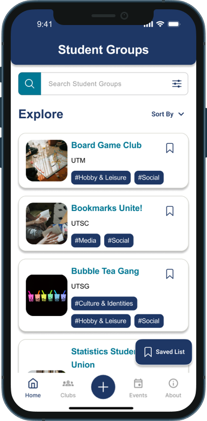
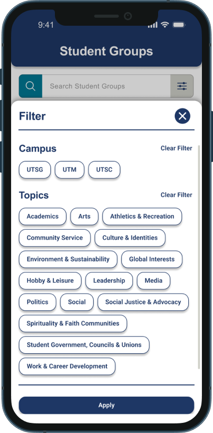
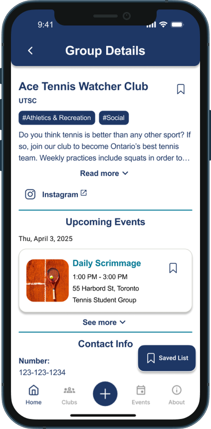
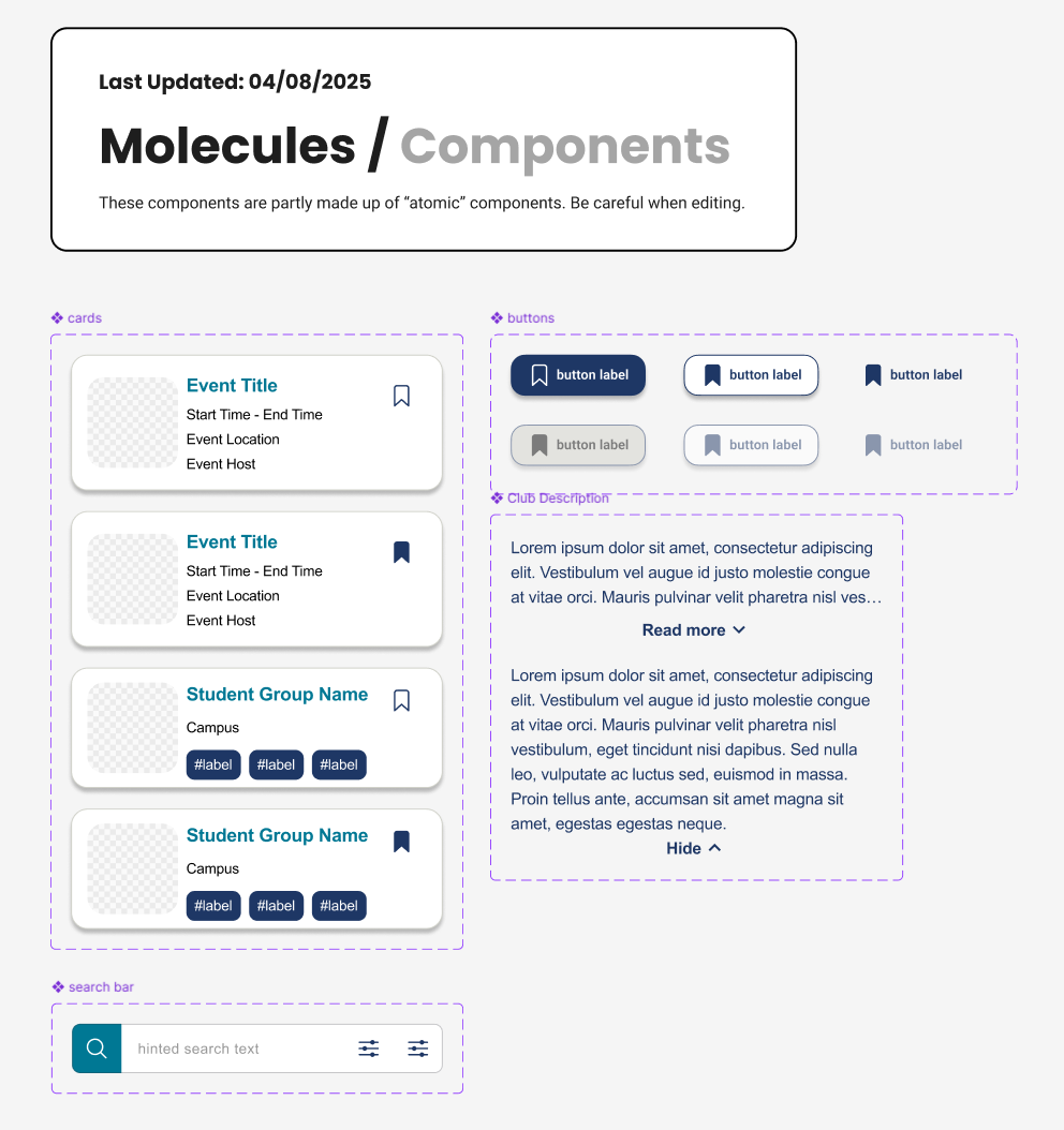
Component Library
To ensure flexibility and scalability, I applied Atomic Design principles, breaking UI elements into different levels of abstraction. This allowed us to build a consistent component library that could easily grow alongside the app’s needs. It also supported collaboration within the team: by designing from a shared system of components, multiple members were able to work on different screens in parallel without worrying about version conflicts or inconsistencies.
I co-developed the Figma component library, using Auto Layout, Variants, and naming conventions to keep the system organized and efficient. I also took the lead on organizing and documenting the library so future design and development teams can quickly find and use the components. Each component was designed with reusability, accessibility, and responsiveness in mind.
To the right are some example components that I worked on.
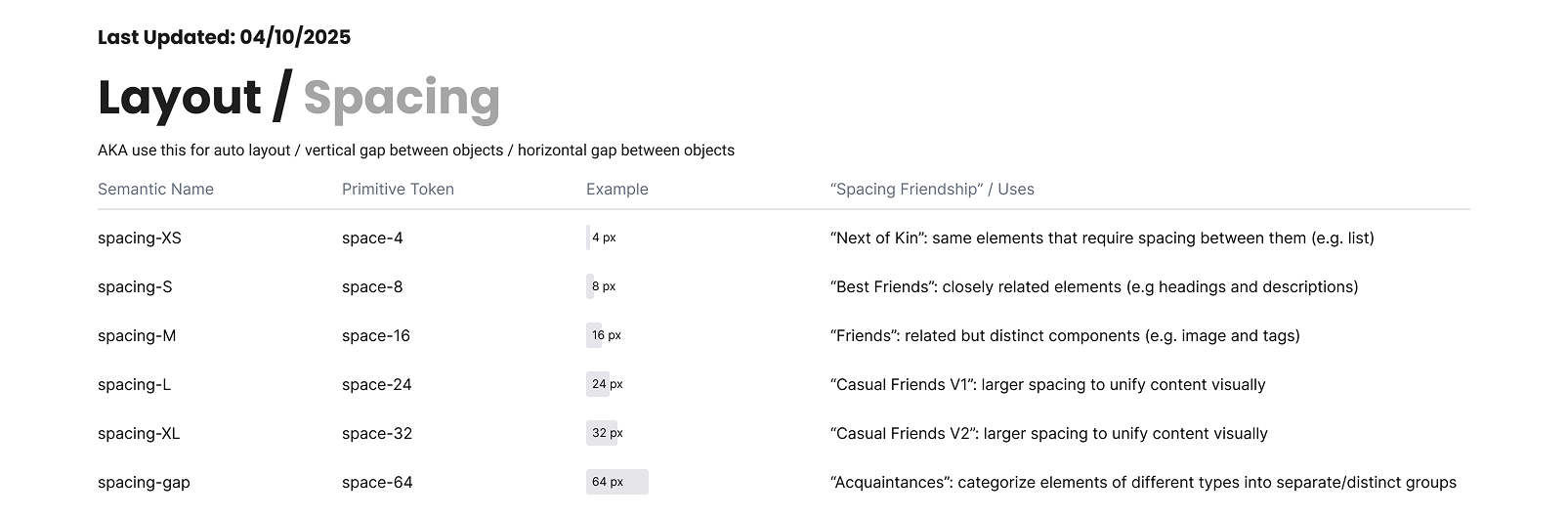
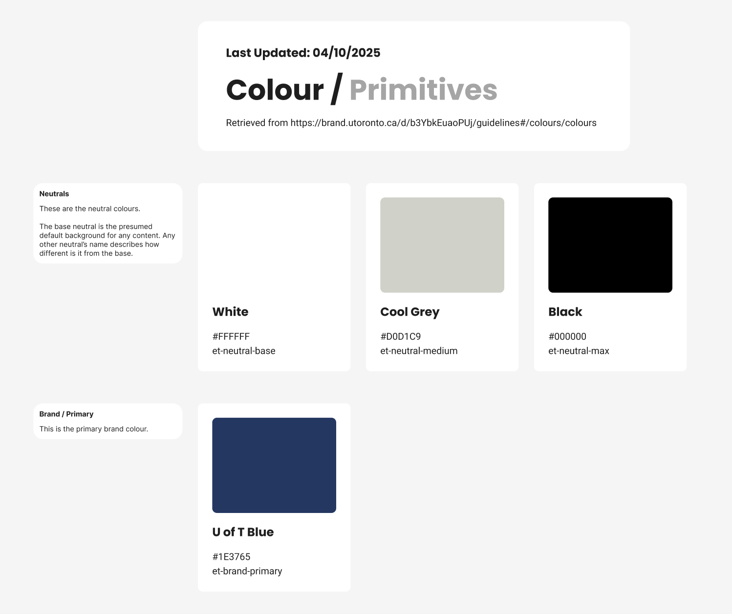
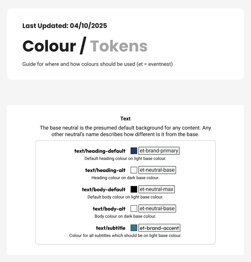
Documentation
To support handoff and team alignment, I also documented variable usage. This documentation made it easier for our team to maintain design consistency ensure smooth handover to the MADLab development team.
Below are some example screenshots.
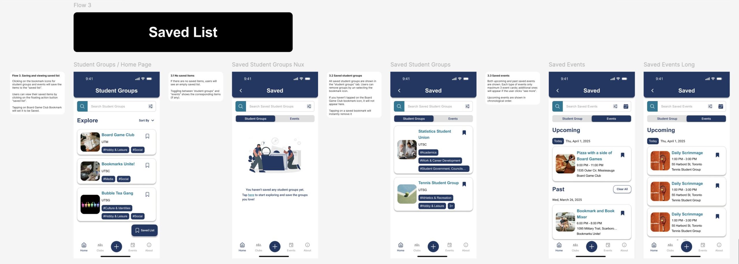
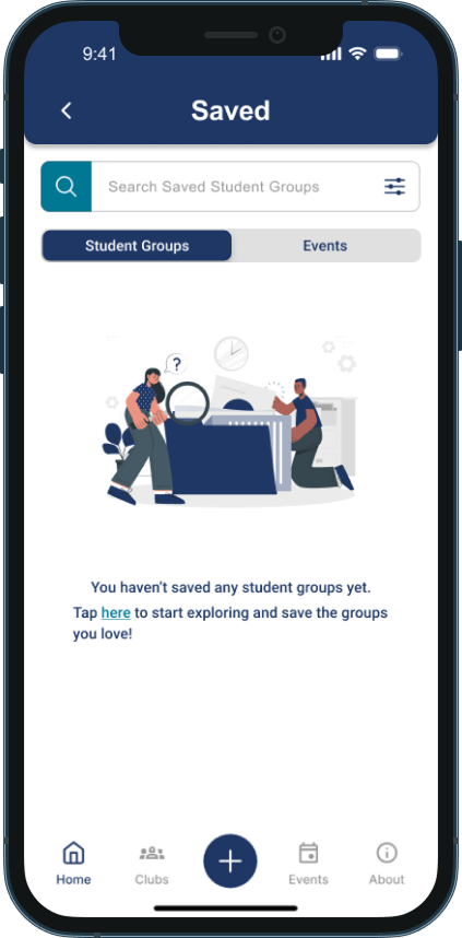
User Flows
User flows were also included in the final Figma deliverable to support developer handoff, providing clear context on how each screen fits into the overall user journey and ensuring smooth implementation.
Below is an example user flow of saving student groups and events.